IT ALL STARTS WITH AN IDEA…..
One day sitting in the Studio Dean office a ‘what if’ moment happened.
We want the Studio Dean brand to be accessible to everyone. Our Studio Dean Interior Design and Spatial planning company is fantastic for clients living in the North East of England but how do you join the Studio Dean experience if you live elsewhere?
How do we get our distinctive style and design to more and more people. Let’s translate our design aesthetic from spatial design into wallpaper design.
The team not only have a vast amount of experience in the Interior Design Industry but also Textile Design. So . . . it began, our In-house team started creating The Studio Dean Edit’s debut wallpaper collection.
Explore our process and learn about how a simple idea can become a beautiful product.
LET’S GET CREATIVE
Our goal was to create nature inspired, forward thinking patterns that would elevate homes and give a truly unique identity and purpose.
We are so lucky to have our studio based in the beautiful rural countryside of Northumberland, so this was where our inspirational journey began.
A morning of foraging in the woods and photographing unusual patterns and textures we had sourced some interesting pieces to start our design process.
IF AT FIRST YOU DON’T SUCCEED, TRY & TRY AGAIN…..
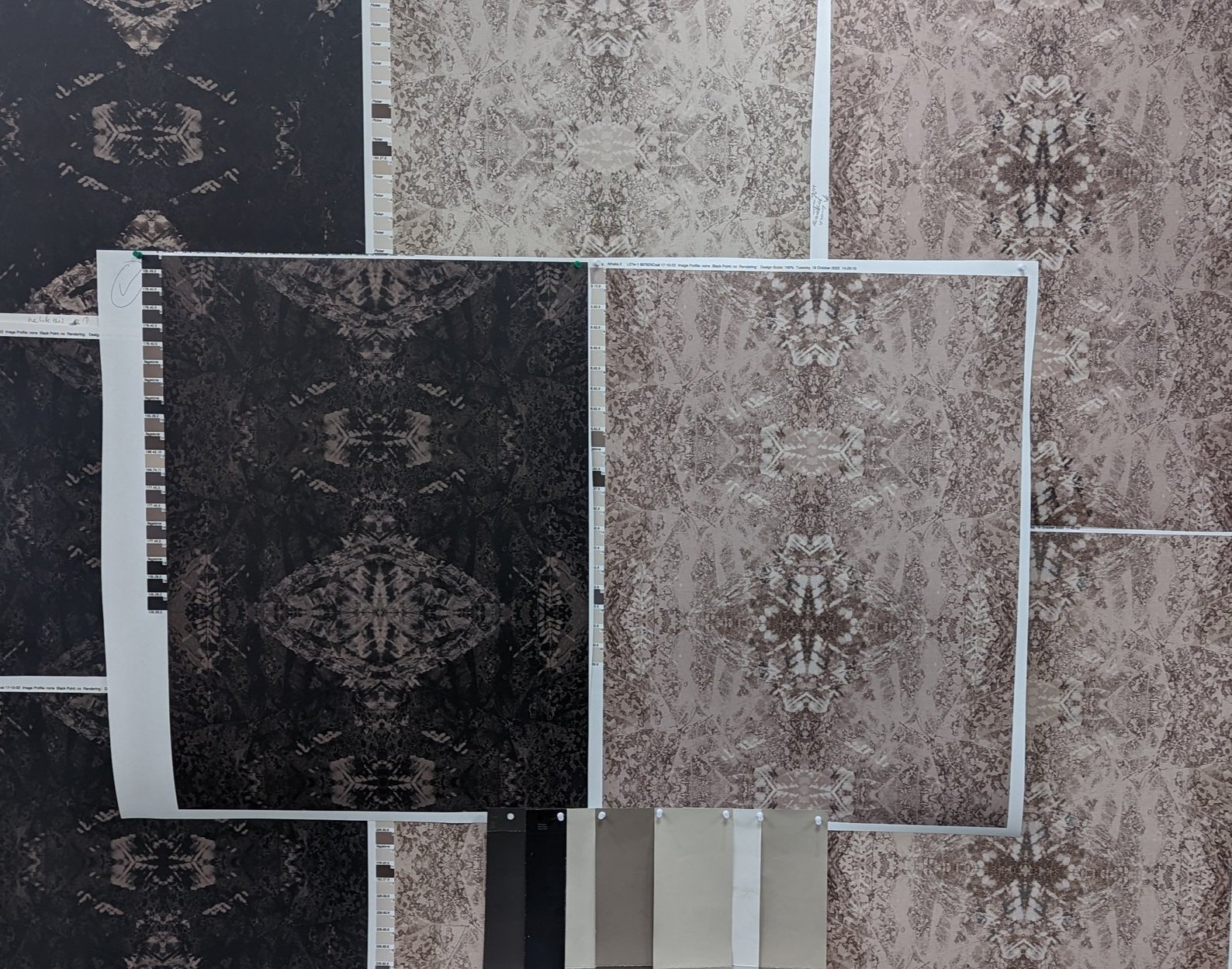
Sample, sample and sample some more! We immersed ourselves in the production process and worked in house at the manufacturer as the papers were developed. Our quest for the perfect colour, texture, scale and overall aesthetic knows no limitations, designs were printed, tweaked and printed again until we found perfection.
Through this dedication we’ve created a versatile and unique collection with the core foundation of our parent company’s signature style & love of nature inspired spaces.
Our Studio Dean Edit aesthetic is born.
BUILDING A COLLECTION
Our key was to work with a core colour palette. We carefully chose a selection of our key colours so the designs worked cohesively as a collection, yet still maintained their individual value as a stand alone design.
Our key palette covers 3 core concepts:
Balanced contrast - The perfect blend of light and dark with a mid tone to bridge the two.
Dark and delicious - Dark browns, blacks and warm, rich, deep tones sit is this area.
Accent colours - Subtle pops of colour that will complement either palette. Such as the deep, dusky greens and blues.
IT ALL GOT REAL!
Check out our designs in production!
We printed our designs on high quality FSC approved, coated, non-woven paper, using eco latex inks.
From one idea over a cuppa we find ourselves here, The Edit is now a fully fledged part of our Studio Dean family and we’re so excited to be bringing a slice of Studio Dean to people outside of our Interior Design service.
Get more insights sent to your inbox monthly by signing up for our newsletter.
Until next time,


